Studio guide · Acrylic painting
How to use a digital grid for an acrylic painting
Prepare a reference, transfer a clean grid to canvas, protect the drawing, and move from block-in to acrylic paint without losing proportion.
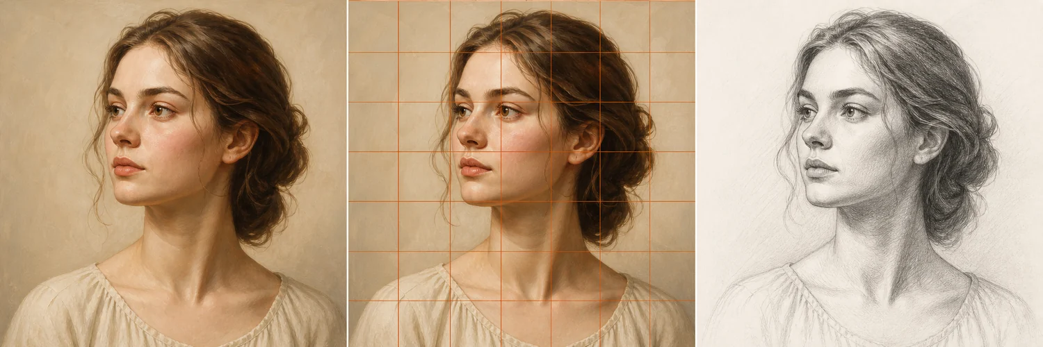
A digital grid is especially useful for acrylic painting because it separates two difficult decisions: proportion and paint handling. Before worrying about drying time, opacity, color mixing, or edges, you can establish a dependable drawing on the canvas. The digital reference remains clean and adjustable, while the physical grid can be made faint enough to disappear beneath the first opaque layers.
A successful transfer is more than tracing square by square. The grid should help you place the composition, large value masses, and essential landmarks. Once those relationships are secure, acrylic paint should be allowed to behave like paint. Broad mixtures, lost edges, and selective detail produce a more unified result than preserving every little boundary from the photograph.
1. Prepare a paintable reference
Crop the photo to the exact ratio of the canvas and decide what the painting is about. Remove distracting margins, check that the focal subject has room around it, and avoid placing important edges directly against the frame unless the tension is intentional. Convert a duplicate to grayscale or squint at the color image to identify the largest light and dark groups.
Use the Grid Maker to add a moderate grid and export a high-resolution version for a tablet or printout. Choose a line color that remains visible over both light and dark areas without overpowering the reference. Save an ungridded copy beside it. You will use the gridded version for placement and the clean version for color, edge, and texture decisions.
- 01Crop to the canvas ratio before adding the grid.
- 02Choose four to ten cells across the shorter side.
- 03Export both a gridded reference and an ungridded reference.
- 04Make a small three-value thumbnail before touching the canvas.
2. Choose a transfer material for the ground
On a white acrylic-gesso ground, a hard graphite pencil used lightly is usually sufficient. On a toned ground, use a watercolor pencil, pastel pencil, or chalk that contrasts gently and remains compatible with the paint film. Avoid waxy pencils and heavy oil-based drawing materials because acrylic may not adhere reliably over them.
Test the line, eraser, and first paint mixture on the canvas edge or a separately prepared sample. Very absorbent grounds may grab pigment and make erasing difficult; slick grounds may cause watery transfer lines to bead. A test tells you how little pressure is needed and whether the first paint layer will cover the scaffold.
3. Transfer the envelope and structural landmarks
Rule the canvas grid from fixed top and side measurements, then label rows and columns. Transfer the outside envelope first: top, bottom, widest points, and the main directional axis. For a portrait, add the head angle, center line, eye level, nose base, chin, and shoulder slope. For a landscape, add the horizon, dominant land masses, and major perspective directions.
Keep curves simple. Mark where an edge enters and leaves a cell, but connect those points across several cells with a continuous gesture. Frequently compare the width and height of the whole subject. This prevents the common situation in which every local mark looks plausible but the painting slowly widens or tilts as it moves across the canvas.
4. Replace the grid with a value block-in
Before erasing all construction, mix one transparent or semi-opaque neutral and reinforce only the essential drawing. A diluted acrylic earth color can establish the silhouette, shadow boundary, and a few overlaps. Keep the mixture controlled rather than watery enough to weaken the binder. Follow the paint manufacturer’s recommendations for mediums and dilution.
Block the largest shadow family and background shapes with broad brushes. Work across object boundaries when values connect. At this stage, the painting should read as a thumbnail even if no small feature is finished. As opaque shapes cover the canvas, soften or remove remaining grid lines so they do not divide broad color passages into tiles.
- 01Reinforce only the final envelope, value boundary, and essential landmarks.
- 02Soften unnecessary grid lines before applying pale or transparent color.
- 03Mass in the largest dark and middle-value shapes with broad brushes.
- 04Check the block-in from a distance and in a mirror before modelling detail.
5. Let painting decisions replace photographic detail
After the block-in, compare color temperature, edge quality, and value relationships using the ungridded reference. Preserve hard edges near the focal area and allow less important transitions to soften or disappear. Mix families of related colors instead of matching each pixel independently. Acrylic dries quickly, so prepare enough of important mixtures and use an appropriate retarder or open medium if you need longer blending time.
Add small highlights, texture, and accents only after the composition works without them. A highlight cannot repair a misplaced eye or weak value pattern. If a structural error appears, repaint the larger shape rather than nudging many tiny edges. The grid has done its job when you no longer need to see it and the painting holds together on its own.
Before you continue
Studio checklist
- The reference was cropped to the canvas ratio before the grid was added.
- Transfer materials were tested for erasability, coverage, and acrylic compatibility.
- The envelope, axes, and large value boundary were established before features or texture.
- Grid lines were softened before pale, thin, or transparent passages were painted.
- The block-in reads at thumbnail size and final detail supports a clear focal hierarchy.
Frequently asked questions
Should I seal a graphite grid before acrylic painting?
Often a light drawing can simply be softened and painted over. Heavy graphite may smear, but any isolating product can change adhesion and absorbency. Test the complete layer sequence and follow the ground and medium manufacturers’ guidance.
What grid color works on a toned canvas?
Choose a muted line that is visible but not extreme: a pale blue-gray on a warm dark ground or a light earth pencil on a cool ground. Avoid colors that will contaminate planned transparent passages.
When should I stop using the gridded reference?
Use it through placement and the first structural block-in. Then rely mainly on the clean reference so grid lines do not encourage equal attention and hard edges everywhere.