Deep dive
Understand the method, not just the steps.
A drawing can contain beautifully rendered details and still fail because its largest shapes are misplaced. Viewers read the silhouette, major value masses, and broad directional flow before they notice texture.
Working from large to small creates a hierarchy of decisions. Each later mark depends on the accuracy of the earlier container, so the artist delays folds, eyelashes, grain, and reflected light until the broad statement is stable.
Large-shape thinking also gives you a practical stopping rule at every stage. Before moving on, reduce the drawing to thumbnail size or step several meters away. Ask whether the subject is recognizable from its envelope, whether the dominant light and dark groups remain distinct, and whether the main direction is still clear. If the answer is no, another hour of surface rendering will only make the structural correction more expensive. Return to the simplest version that still exposes the problem, repair that relationship, and then rebuild detail selectively.
Find the outside envelope
Connect the highest, lowest, widest, and most inward points into a simple container. The envelope does not describe every contour; it establishes the subject’s overall footprint.
Group values into families
Squint until small transitions disappear. Separate the subject into a few connected light and dark groups before modelling individual forms.
Let details explain structure
Keep only details that clarify a turn, overlap, or material change. Decorative marks that do not support the large form can wait or be omitted.
Common mistakes
Starting with the most interesting feature
A face, fold, or highlight may be attractive, but placing it before the large mass makes the rest of the drawing bend around an unverified detail.
Drawing many small values
Too many separate tones break the image into noise. First decide which areas belong to the same light or shadow family.
Polishing one area too early
Keep the whole drawing at a similar level of finish until proportion and value design are dependable.
Progress the skill
Test the same hierarchy at different scales
Make three versions of one subject: a two-inch thumbnail, a medium block-in, and a larger study. Keep the same envelope and value grouping in every version. If the large study begins to lose the clarity of the thumbnail, compare the dominant shapes rather than adding more transitions. Scale should provide room for better decisions, not permission to fragment the design.
You can also impose a mark budget. Allow five lines for the envelope, three interior shapes, and three accents. A limited budget reveals which information actually carries the subject. When you later add detail, require every new mark to clarify an overlap, material change, focal point, or turn of form.
Practice exercise
Three-shape simplification
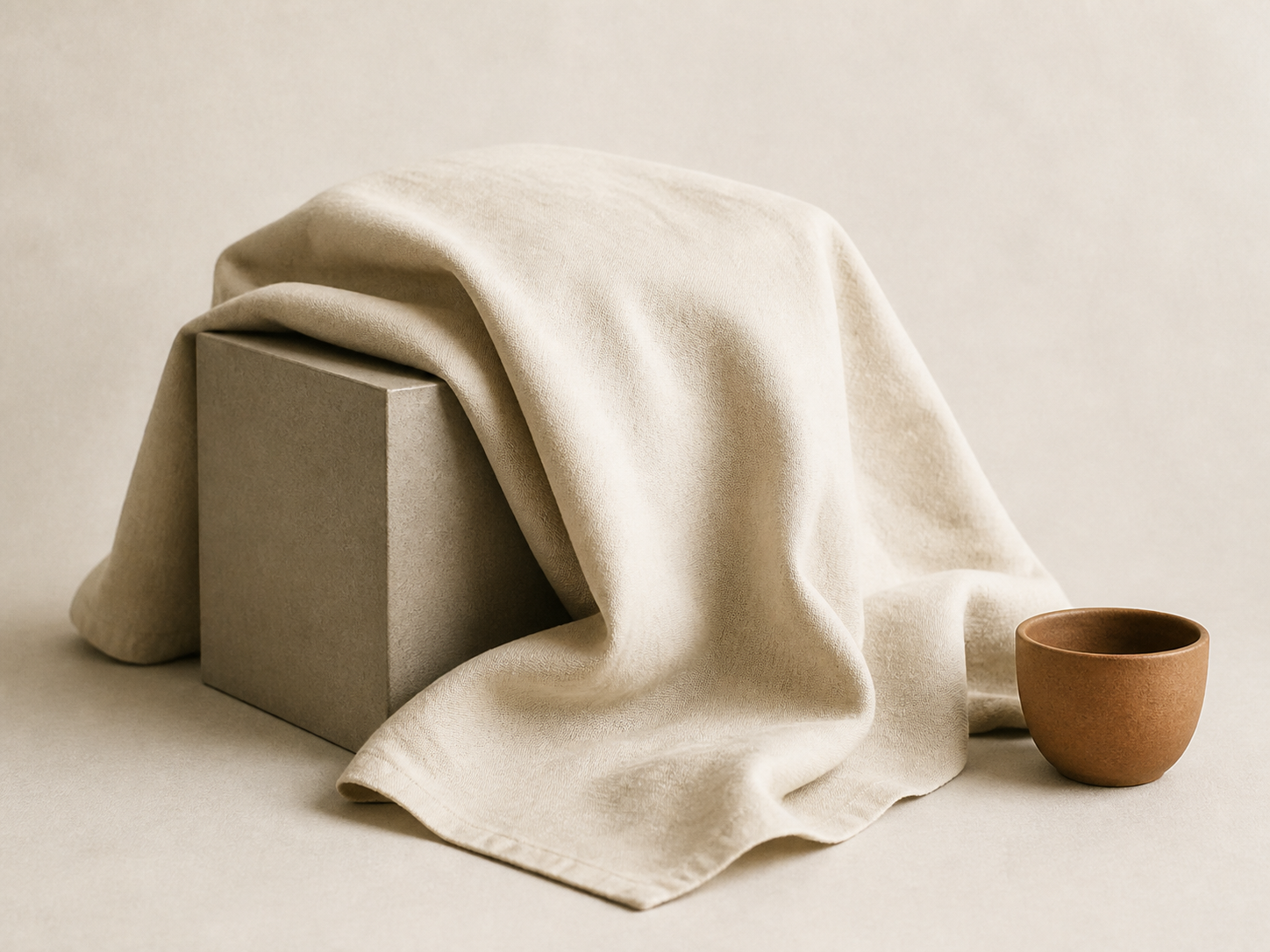
Choose a draped object or simple figure reference and reduce it aggressively.
- 01Draw one outside envelope.
- 02Divide the subject into no more than three major interior shapes.
- 03Assign each shape a light, middle, or dark value.
- 04Add only three structural internal lines.
- 05Compare the simplified study with the reference from a distance.
Frequently asked questions
How large should a “large shape” be?
Large shapes are relative. At the start, think in terms of the whole subject, its main divisions, and dominant value families—not individual features.
Does simplification make the result less realistic?
Usually the opposite. Accurate large relationships create a stronger sense of realism than many unorganized details.
When is it safe to add detail?
When the silhouette, placement, and large value pattern still read clearly at thumbnail size.